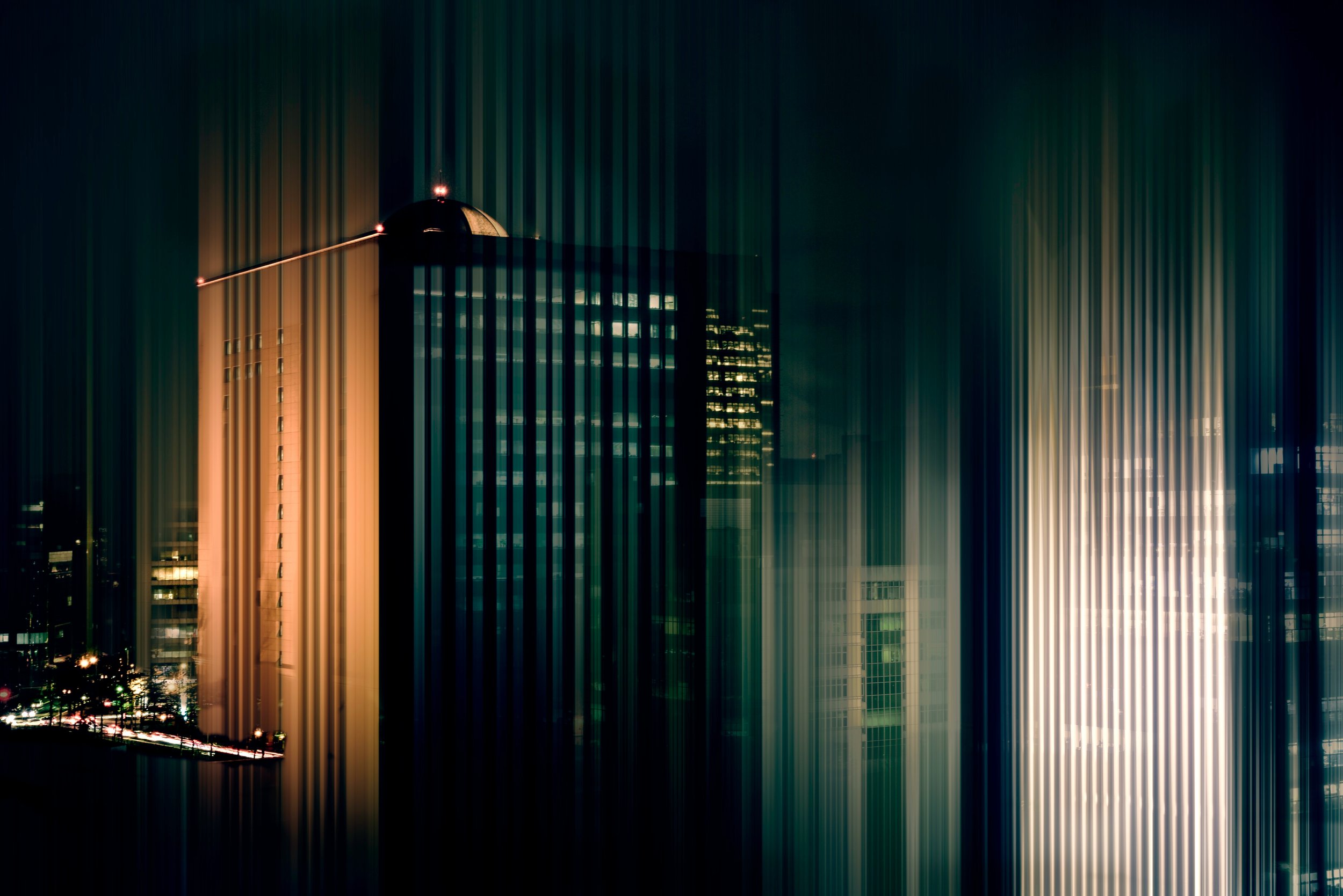

NOCTURNE
As the sun sets what’s before us changes, the streets are dimly lit, but above the city lights shine bright amongst the stars. It’s here when romance often sweeps in, as we look to the night sky and discover its nocturnal beauty. Colour changes when viewed by moonlight, the moon itself appears bluish as the human eye transitions from day to night vision, with blues appearing brighter, more easily seen and reds darkening under different levels of illumination, this is known as the Purkinje effect.

hold colour within their darkness that's revealed through the metallic qualities
This shift in our visual spectrum as our eyes adjust to different levels of light, creates these precious jewel-like tones.
Deep plum 20-0102 TPM, 20-0122 TPM, blue tinted red 20-0076 TPM, broody grey tones, sitting between navy and black 20 – 0140 TPM, 20-0135 TPM and the deepest graphite 20-0141 TP.
hold colour within their darkness that's revealed through the metallic qualities, thus giving the palette an air of mystery, colour in this way becomes sophisticated.

Nocturne gives us a different perspective on colour
Nocturne gives us a different perspective on colour, we are inspired by the magic of the midnight sky, how the colours adjust to moonlight in a majestic way. Using the Pantone Metallic Shimmers we have created a refined palette that captures the essence of moonlit colour..

choose materials that offer light reflective qualities to bring out the depth of tone
These colours are perfect for design stories and concepts with a refined edge, products that aspire to the luxury market. Their soft, sensual glow adds an allure, a sense of luxury that taps into our desires. Nocturne colours are perfect for elevating interior and tech products or adding a sultry shimmer to fashion and accessories for the holiday season, choose materials that offer light reflective qualities to bring out the depth of tone.
Read the full story on pantone.com